Podcast Episode Navigation

Streamlining Podcast Episode Navigation on iHeartRadio

OVERVIEW

How can we improve episode discovery and navigation to retain users and keep them engaged?

iHeartRadio's podcast platform offers an expansive library, with countless shows containing hundreds, if not thousands, of episodes. Despite this wealth of content, a significant challenge for users has been the lack of intuitive tools for discovering and navigating individual episodes, especially within a particular series. So how can we improve episode discovery and navigation to retain users and keep them engaged?This case study details my approach to redefining the user experience for podcast episode navigation, with a focus on designing and implementing episode-level search and improving backlog navigation on show profile pages and within the global search page.
TIMELINE

Q3 2024
(July - September 2024)

MY ROLE

UX Designer (Lead Designer)

TEAM

Product Manager
Project Manager
Mobile Engineers

SKILLS

Evaluative Research
Business / Growth Thinking
Mobile Design (iOS + Android)

THE PROBLEM

Listeners struggle to find specific podcast episodes, especially when exploring deep backlogs.

User feedback from the iHeartRadio app reveals that listeners are struggling with the current podcast experience. Many users report frustrations with the lack of key navigational features—such as episode search, filters for unplayed or downloaded episodes, and the ability to quickly scan episode cards. Without these capabilities, the experience feels limited and risks driving users away, especially as competitors like Apple Podcasts, Spotify, and Pocket Casts already offer these features and set higher expectations.

THE SOLUTION

A Streamlined Podcast Listening Experience that Empowers Users to Navigate with Confidence

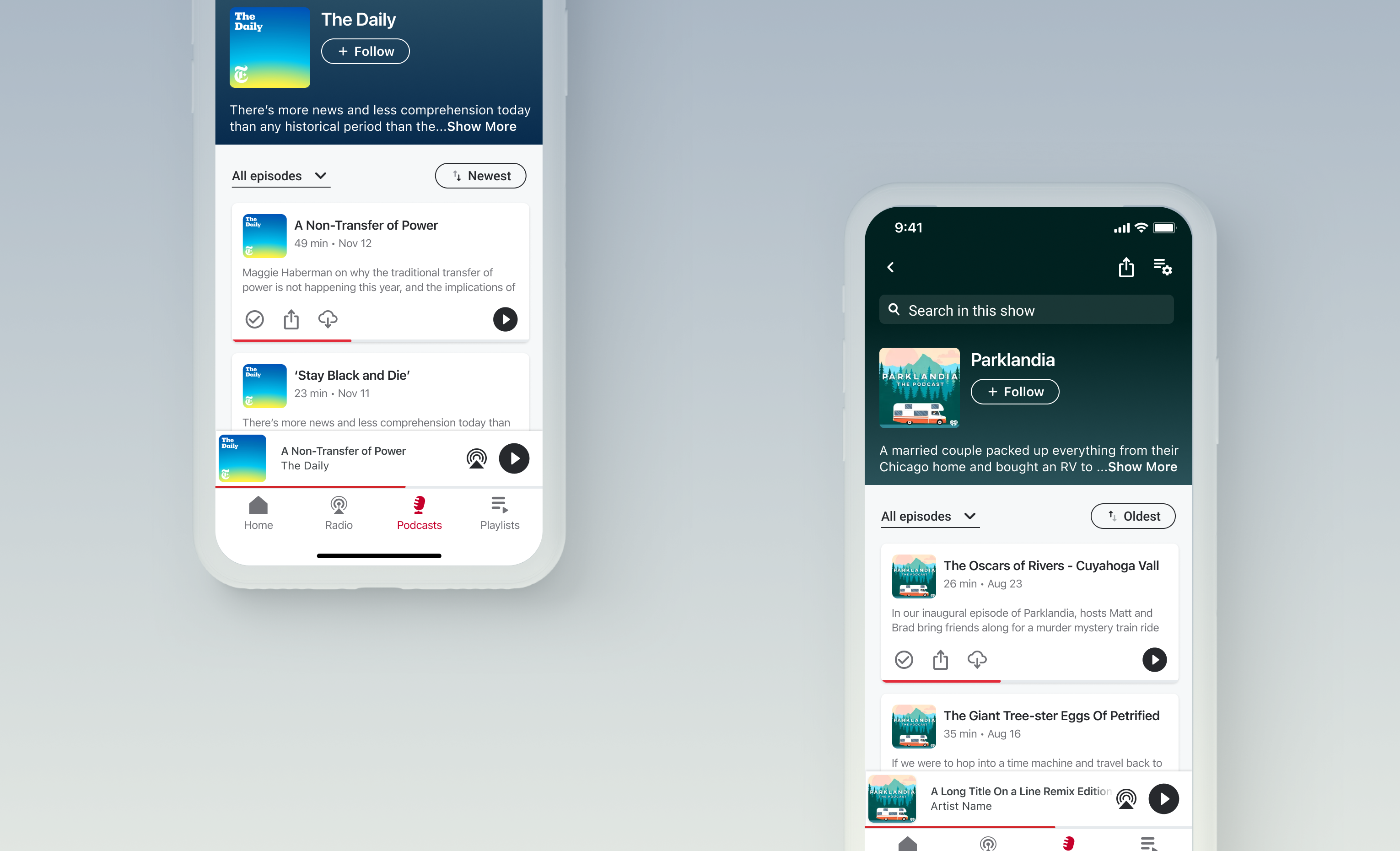
To significantly boost user retention on the iHeart platform, our team developed and launched new tools for episode filtering, sorting, and searching. These enhancements improve navigation and content discoverability within iHeart’s podcast library.

Users now have the ability to filter episodes by played vs unplayed, and sort them by date. Furthermore, an integrated episode-level search function allows listeners to quickly find specific content using keywords, topics, or even guest names. These intuitive features streamline the content discovery process, making the app more user-friendly and competitive in the podcast streaming landscape.

THE PROCESS

Initial Research and Identifying Key Gaps

My design process began with thorough desk research, reviewing existing customer feedback to pinpoint current pain points. This analysis revealed a clear trend: users consistently struggled with finding specific episodes within large backlogs and frequently expressed a desire for filtering options for episodes they had already played or downloaded.
The most common complaints are around difficulty finding episodes in large backlogs -- especially for finding played/downloaded episodes.
(Feedback collected from the App Store, Zendesk, Reddit, and Facebook)
Another complaint was that users struggled to search for episodes within a large backlog of episodes.
(Feedback collected from Zendesk)

Taking a Look at the Competitive Landscape

Additionally, I conducted a comprehensive competitive analysis to understand the current landscape and identify features missing from our platform. This research from both the landscape and the customer feedback highlighted critical gaps in our episode navigation experience, specifically the absence of: Advanced episode filtering (e.g., by unplayed, downloaded, season, or saved), Intuitive episode sorting, and Episode search within show profiles
Competitive analysis reveals that iHeart is missing a lot of critical features compared to other podcast streaming competitors

Narrowing in on Opportunity Areas

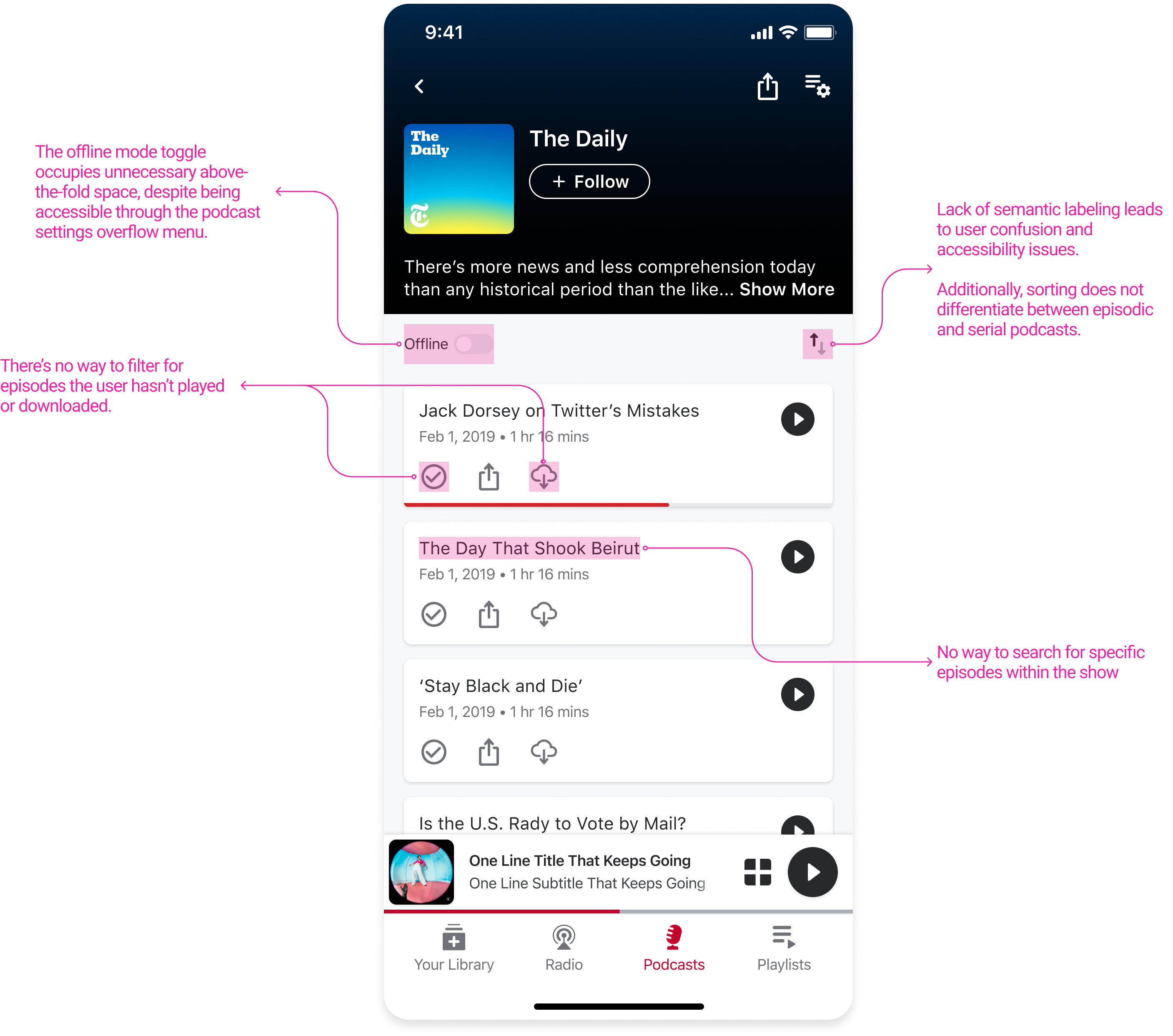
When analyzing the old podcast profile screen, I uncovered several areas of friction. For example, the sort button lacked semantic labeling, the offline toggle occupied too much above-the-fold space, and users couldn’t easily download or mark episodes as played without scrolling to locate them.

Building on these insights, as well as user feedback and competitive research, I partnered with the product manager to refine the filtering, sorting, and in-show search experiences.
Screen taken from old podcast profile page

FEATURE 1

Sorting Episodes

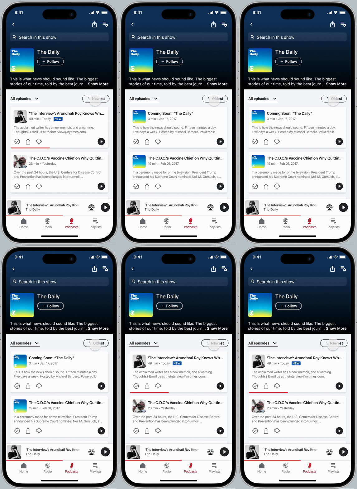
My initial focus was on improving the existing features on the podcast profile page. The current experience offers simple episode navigation through basic "new to old" and "old to new" sorting, but lacks clear, semantic labels or user feedback.
The new design introduces a labeled sort button with clearer visual cues to signal interactivity and improve accessibility.

The existing sorting behavior also fails to differentiate between episodic and serial podcasts and defaults to the same sorting for both. This leads to a vague and confusing experience that doesn't align with common listening habits. For instance, a user listening to a serial podcast typically wants to start with the first episode. The current "new to old" default, however, presents the last episode of the series, hindering a natural listening flow.

The updated sorting now adapts to the type of podcast: serial podcasts default to Oldest so users can easily begin with episode one, while episodic podcasts, such as The Daily, default to Newest so listeners can quickly access the latest episode.

FEATURE 3

In-Show Episode Search

The next feature I focused on was improving episode search within the show profile that allows users to search specific keywords and lines from transcripts within a show and access the larger episode backlog. This addition came with several challenges: what is the best placement of a search entry point that is intuitive but not intrusive? How do we define the behavior when a user types something into the search input? What does dismissal of the search page look like?
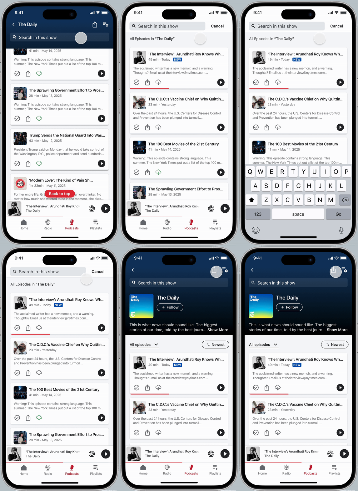
Through several design explorations, I landed on placing the search bar at the very top of the page, just above the show description, to create a clear connection between the search function and the specific podcast. To ensure users didn’t confuse this with global search, I introduced explicit copy “Search in this show.

I also implemented a sticky header, keeping the search bar visible as users scroll through large episode lists. This ensures that search is always accessible, no matter where they are on the page.

When tapped, the search bar takes over the screen and surfaces episodes in the default sort order. Filters don’t affect search results, maintaining a predictable experience. Additional contextual copy, such as “All episodes in The Daily,” clarifies what content is being shown.

RESULTS

🚀 Takeaway: Overall, we found that the sort feature drove wide discovery, while the filter feature deepened sessions. Together, they fueled sustained listening growth that lead to ~440k extra monthly listening hours
📈 Podcast TLH is up +4% post-launch of Filter + Sort, proving measurable engagement impact.
🎧 Scale matters: iOS average TLH (~7M hrs/mo) gained ~+280k hours; Android (~4M hrs/mo) gained ~+160k hours — total ~+440k extra listening hours per month.
🔎 Sort = breadth → higher adoption (Android CTR 9.6%, iOS 6.4%), multiple clicks per user.
🎯 Filter = depth → lower adoption but stronger engagement (iOS 4 clicks/user, Android 2).