Spin Dashboard

Optimizing Spin Scooter Distribution with Data Dashboards

OVERVIEW

With the rise of electrical scooter usage throughout metropolitan areas, e-scooter companies are faced with the challenge of ensuring access to affordable transportation on a smaller, urban scale.

Working with Spin, a leading micro-mobility product service, I designed a data dashboard that imagines a platform where both gig workers and data analysts can work together to asses scooter availability, pickup, and redistribution. Through this data design, Spin is able to provide equitable distribution that reduces 'transit deserts' throughout Pittsburgh's metropolitan area.

TIMELINE

6 weeks
‍Sep – Oct 2021

MY ROLE

Product Designer
Visual Design
Motion Designer

TEAM

Vikitha Bezawada
Ashley Kim
Ziwen Zeng

SKILLS

Data Visualization
Dashboard Design
Motion Design

THE PROBLEM

How might we enable various Spin stakeholders to collaboratively ensure equal scooter distribution throughout cities?

Transit Deserts – defined as an area with limited transportation supply. The lack of transportation options present in transit deserts may have negative effects of people’s health, job prospects, and economic mobility.

As e-scooter adoption becomes a more popular form of affordable, short-distance transportation throughout US cities, distribution of scooters throughout a city can either alleviate or aggravate existing 'transit deserts.' Spin is faced with the challenge of overseeing distribution of scooters to provide equitable access throughout various city neighborhoods. Looking at objectives of two different personas – a remote data analyst and a local gig-worker – how can we design a solution that bridges a communication gap to allow these stakeholders to work together to evenly distribute scooters?

THE SOLUTION

A narrative conveyed with a data-driven display

As lead product designer, I designed a data dashboard that allows Spin gig workers and data analysts to work together to decide distribution routes and calculate the most effective methods for both scooter allocation and the individual needs of each stakeholder. Using data visualization, this dashboard conveys a visual narrative that allows for cross collaboration for two personas across one single dashboard.

Introducing a new vision of SPIN collaboration.

THE PROCESS

Spinning together a project roadmap...

Throughout our research and design phases, we focused on the following questions: How do we convey a story through our project? What combination of data and visualizations should we focus on? How do we use the dashboard as a communication tool between our two personas? How do we apply design principles to data-driven displays? Our overall timeline consisted of persona research, analysis and synthesis of primary and secondary research, low to mid-fidelity prototyping, final design and pitch to client.

Personas to highlight different needs and pain points.

We developed the persona of Kalen, a scooter redistribution gig worker at Spin. : A key takeaway from this synthesis is that efficient usage of workers incentivizes them to form clusters. Due to a lack of coordination between the gig workers, they tend to pick up and drop off scooters at the location that’s most convenient for them. This creates clusters of scooters in some locations instead of ensuring an even distribution throughout the city.

Analyzing data: when to filter and what to filter

We started by creating an affinity diagram of each stakeholder’s needs. We categorized these from low to high priority to help us identify the most important data to be displayed in the dashboard. Through this exercise, we aimed to capture the types of thick and big data we would need. We were able to use the data to reveal patterns and recognize themes.

Research Synthesis: enhancing communication between the users

The concept map for the current model mapped out Mia’s and Kalen’s needs while paying attention to their behaviors and actions at every touchpoint. We identified the overlapping needs and incorporated that into the future state model.
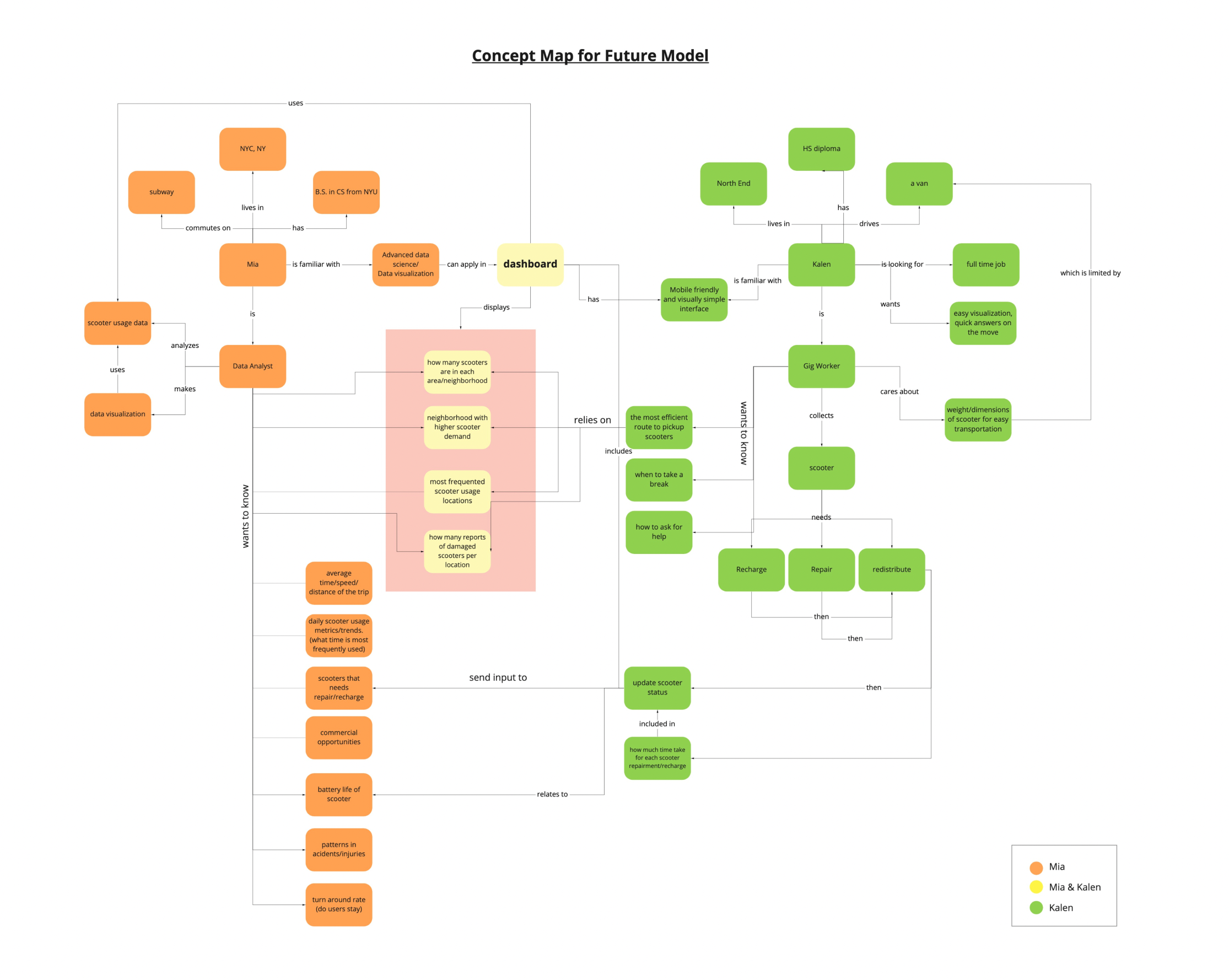
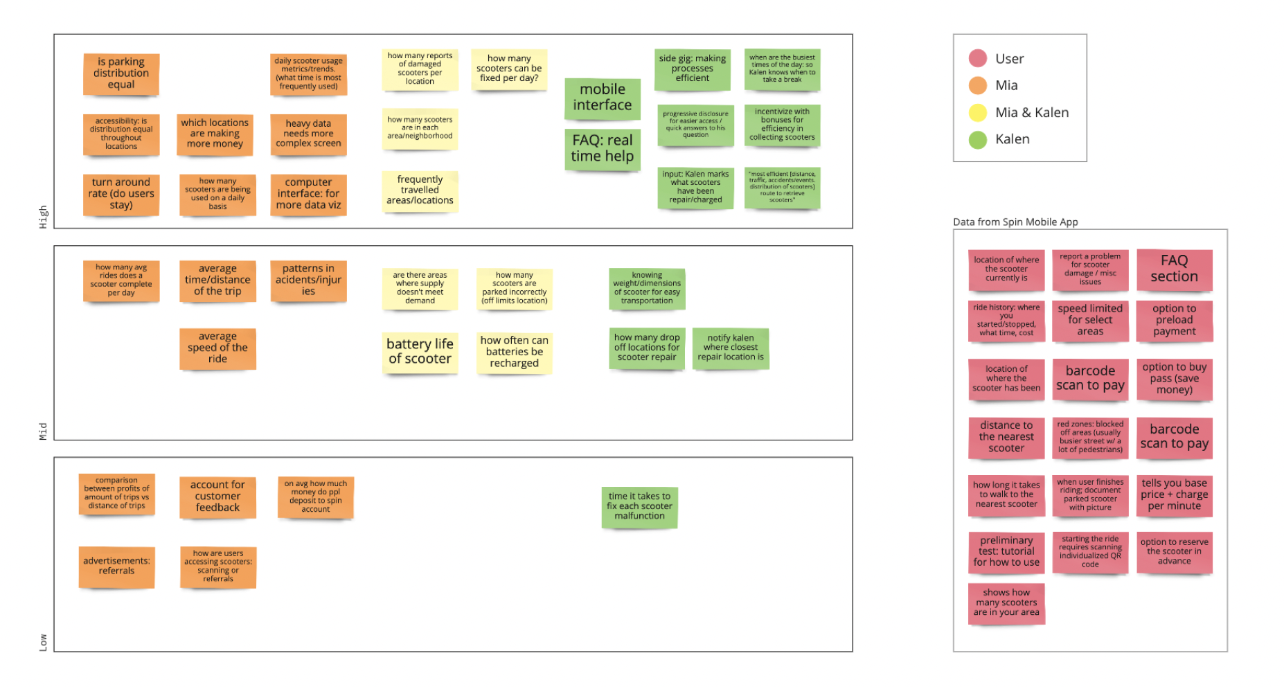
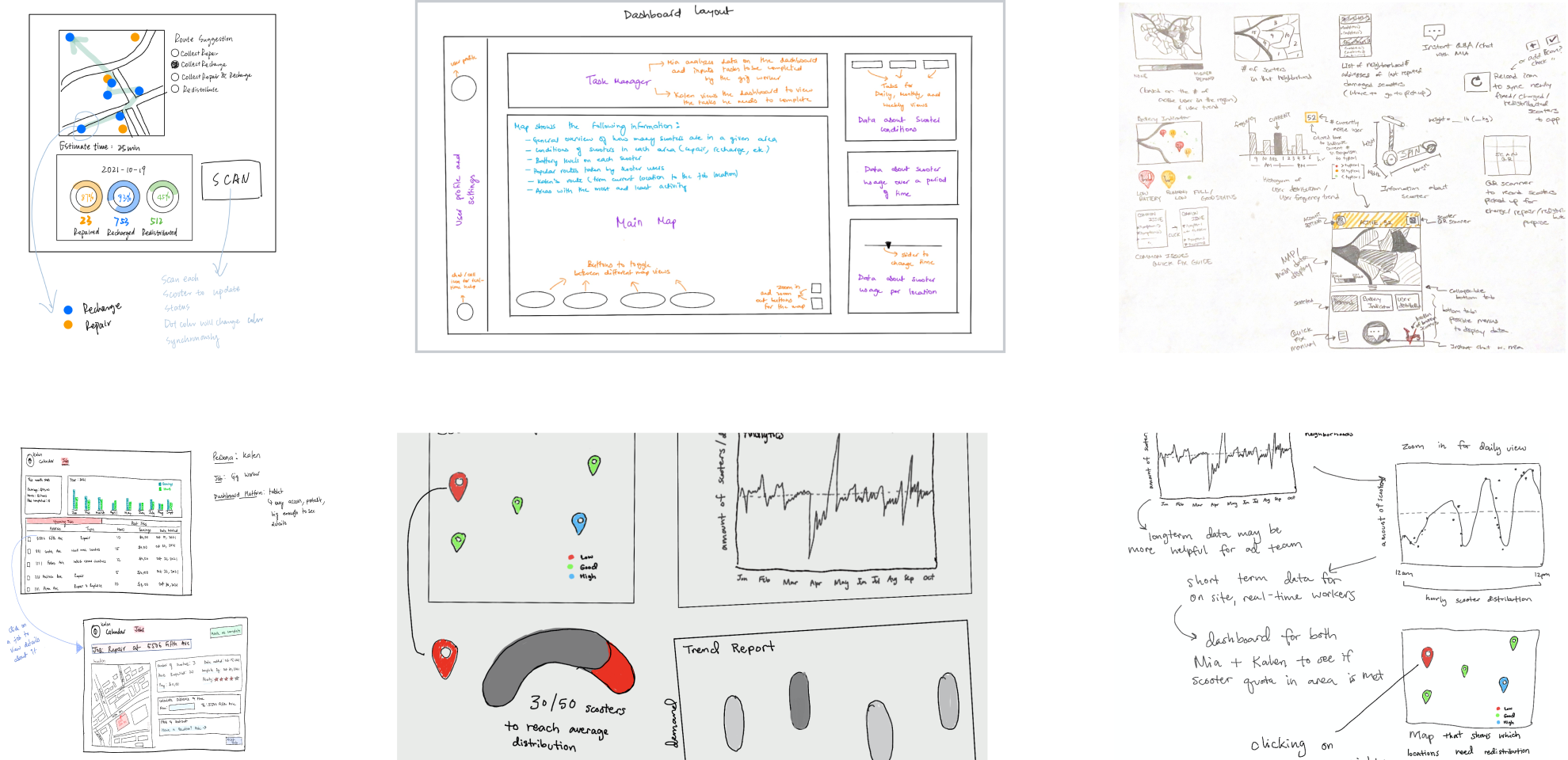
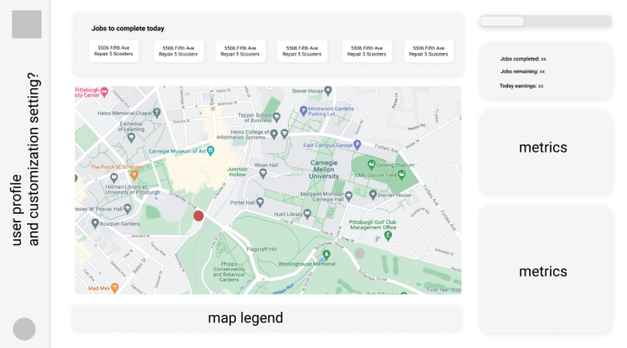
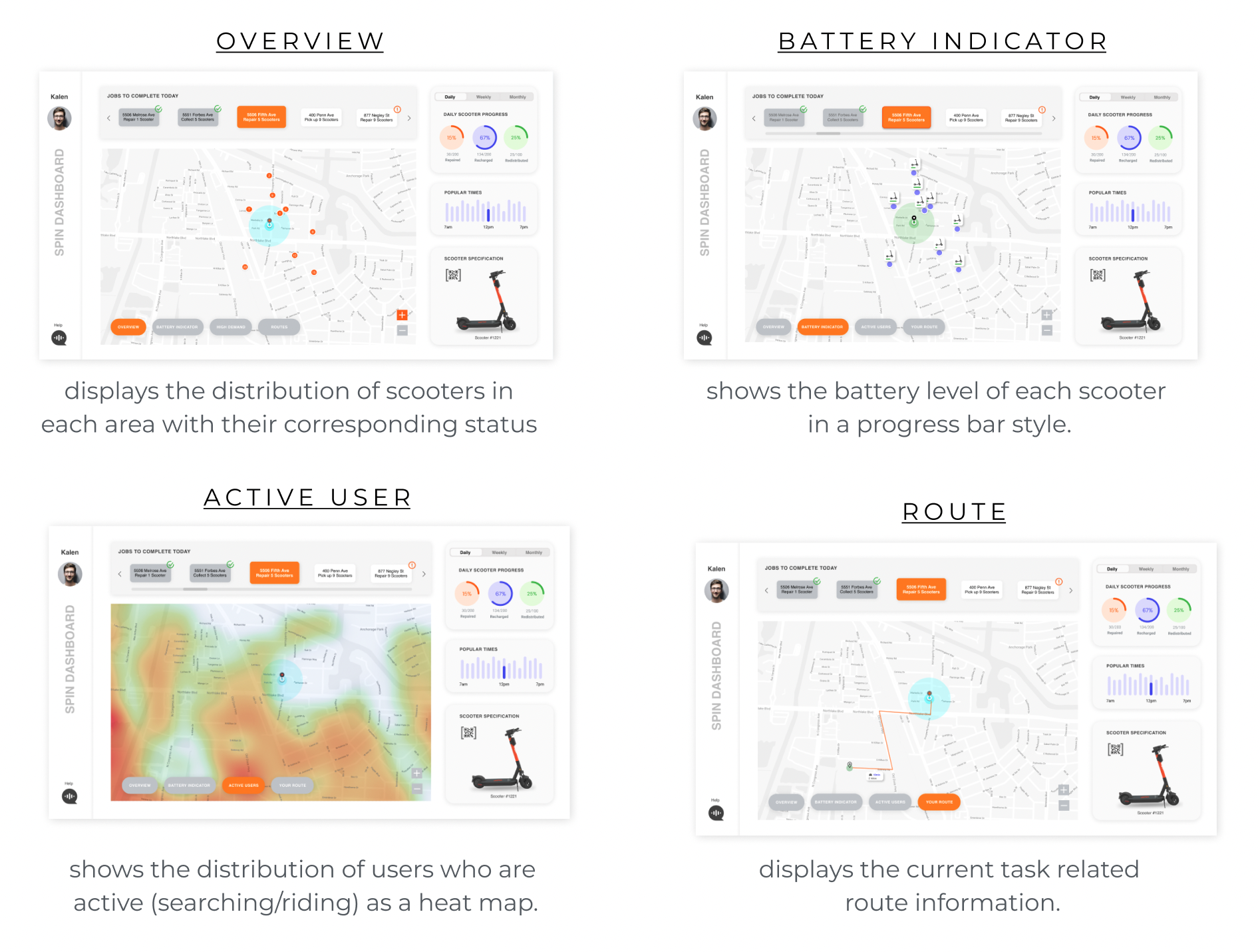
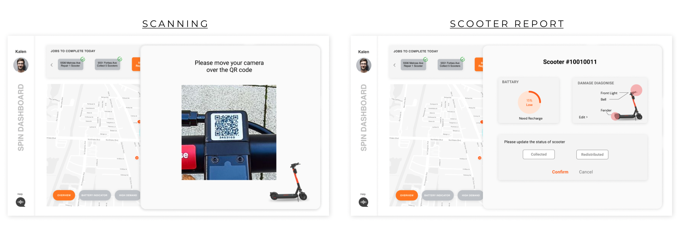
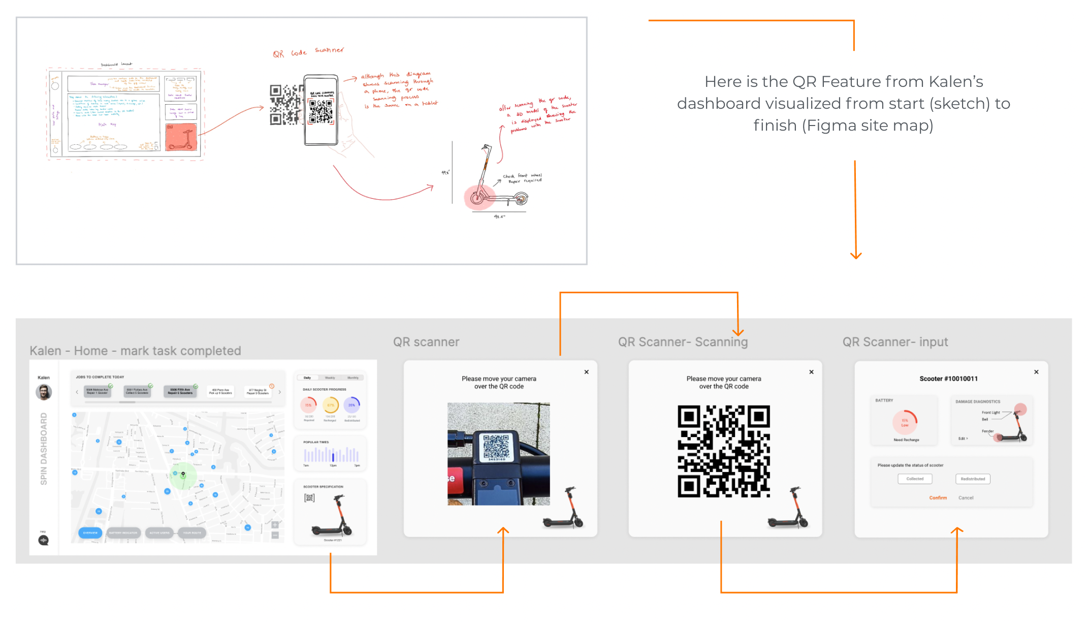
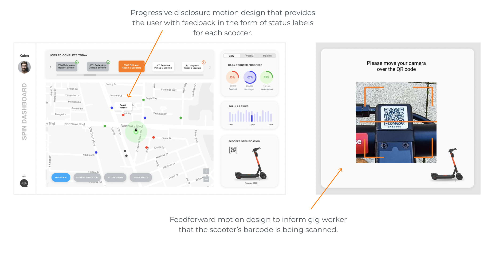
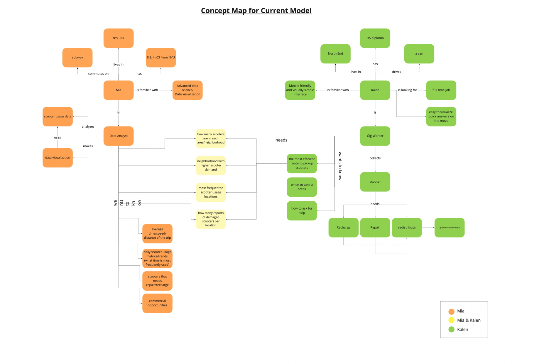
Conversely, the future state model highlights one main element: the dashboard. Before moving onto the dashboard iteration phase, the team wanted to have a good understanding of how Mia and Kalen can both benefit from the same dashboard design. In addition to the essential scooter data, we wanted to focus on bridging the communication gap between the two personas.

DESIGN IDEATION

Prototyping! Prototyping! More Prototyping!

After synthesizing our research, we hypothesized that communication between Mia and Kalen needs to be improved. To start our design ideation phase, we started by making low-fidelity sketches individually. This produced some great ideas that we carried forward, such as having multiple map views, a QR code scanner, a voice chat feature, and a timeline for gig-worker jobs.

PROTOTYPING

Constructing a clear user flow guides the user’s view.

Since people typically read from top left to bottom right,  we decided to follow this structure in prioritizing the elements and guiding the user’s view. Hence, we thought the elements that reflect the current scooter status should be on the left and other data like historical rider data on the right.

Additionally, according to the principles of progressive disclosure, high priority elements should be able to grab immediate attention on a layout. After the team shared individual sketches, we agreed that the most essential feature for both of the personas is the map feature that displays scooters’ real-time location and status information. Therefore, we placed the map in the center as the largest element to immediately grab the user’s attention. The larger size of the map also helped decipher details easily.

Overlaying analysis on a map keeps data visualization simple.

The map feature is  divided into four categories: Overview, Battery Indicator, High Demand (Active User), and Route. This was designed using overlays on the same map to maintain consistency.

Leveraging multi-modal design to increase efficiency

Since Kalen would be on-site collecting scooters and completing different taks, we included a QR code scanner that can register the scooter through a quick scan. This feature will then display a rapid report of the scooter status based on the information stored in the scooter. Through the QR code scanner, Kalen can quickly diagnose the issue and update the status of the scooter.

MOTION DESIGN

Developing feedforward and feedback greatly improves usability.

The team started by sketching quick-motion design ideas. Afterward, ideas were developed into high-fidelity Figma prototypes with hotspot interactions and AfterEffects motion design.

When implementing motion into our dashboard design, a primary goal for our team was to include motion with intention and thoughtfulness. To achieve this objective, we created animations that provide appropriate feedforward and feedback to the user. These animations are incorporated across all elements of the dashboard.

ITERATIVE DESIGN

The refinement phase is also a cyclical process.

After receiving feedback, we developed the final iteration of the dashboard. Some notable refinements we made to our final iteration were adjusting colors in the overview map and redesigning route maps and task implementations.

While the dashboards for Mia and Kalen share many similar overlapping features, one need we felt still hadn’t been addressed for Mia was providing a broad, overarching map of the variations in ridership in each neighborhood, number of active users, and time throughout the day.  With the addition of a popular neighborhoods feature, Mia can quickly view and analyze the overarching ridership trends and utilize these patterns to predict and inform decisions.

REFLECTION

Initially, I was quite apprehensive to participate in a group project where every participants’ role was ‘designer.’ I was worried there would be clashing in design ideologies and opinions on aesthetics. However, I believe I was very lucky to be placed within a group that shared similar sentiments and perceptions as me. When we did encounter slight disagreements, we learned to logically analyze the design to come to a collaborative decision. Overall, this project has taught me a lot about teamwork and, specifically, what effective teamwork looks like.

Additionally, group work made the overwhelming project of data dashboards much more feasible and digestible. Much of the hard work came not from the actual designing of the dashboard, but from the discussions we had as a team for ideating ideas, planning out tasks, and balancing out work amongst each other. This “behind the scenes” work was key to staying  on top of projects and efficiently producing good quality work.

Lastly, working in a group has unexpectedly helped me to absorb and develop my technical skills when working with tools like Figma. Simply observing my teammates at work has provided me with deep insight into understanding specific functions and tools.